
5 Tips for Using Images on Your Website
These tips are for all of my fellow side hustlers, entrepreneurs, and businesswomen. They are to help you best implement images on your websites. And, just in case you didn’t know this, you absolutely SHOULD have images on your website! We are visual creatures. We like colors, images, textures, patterns. And it’s easier for us to digest text when its broken up by images or has corresponding images.
However, there are some very important tips for uploading images to your website to make sure they're working for you and your website.
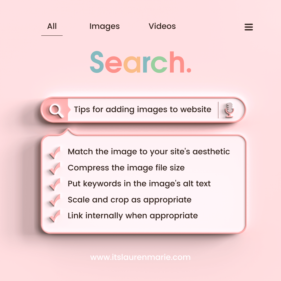
1. Match the image to your website's aesthetic
As a brand and a business, you want everything you put out into the world to be cohesive. You want people to immediately recognize and feel comforted by you and your brand. So that means everything from the font and color palette to the logo and photos should be on one accord. They should have the same vibe, theme, and/or look. For example, here on my site, I like bright and clean and my colors are coral and teal. So I tend to use photos with bright, white backgrounds and soft colors. It doesn’t need to be matchy-matchy, but consistent.
2. Compress the image file size
Images tend to be large files. And large files slow down your website. And people leave websites that take too long to load. Eeek! We don’t want that. So we need to make the images smaller. A quick and easy way to do this is through a website called CompressJpeg/CompressPng. Bookmark it and just run your photos through it real quick before uploading to your website.
3. Put keywords in the image's alt text
We often ignore alt text. Alt text is one of those nifty accessibility features. It is essentially a description of the image. It is read aloud to visitors by screen reader software and used to index by search engines. It also displays on the page if the image fails to load. It helps to also throw in some of the keywords for your website. So, for me, if I upload a photo of a new website. My alt text may read, “Squarespace Designer shows newly launched website for a fashion stylist.” Short, quick, descriptive. That’s it. For every photo.
4. Scale and crop the image as needed
How you want the image to display within your website is a matter of personal preference. I tend to like my photos with a 1:1 ratio (square) and on the right side of the text, at the beginning of a paragraph. But that’s just me. You may like photos with a 3:2 ratio (landscape) and on the left, at the bottom of the page. It is completely up to you. You can and should scale and crop your images to fit your content.
5. Link internally when appropriate
We want visitors to our websites to stay on our website as long as possible. I mean, we put a lot of work into it! There’s valuable content all up and through it! One way to keep visitors on the site is to give them lots of internal links. Internal links take visitors to another page on the same website. If I’m posting to my portfolio page an image of my latest project, I may link it back to my design services page. This way if the person really liked the image or the content with it, they can easily get to a description of the packages I offer. On that page, I’ll link to my Contact page so they can easily send me a message if they’d like to work together. It won’t fit every image. But when it’s appropriate or natural, link it!
How does that sound? Doable? Ok, good. If not, leave me a comment. Let’s talk about or troubleshoot it. 🤗